Astoria Oregon Rebrand


Brochure

Inside

Branding guidelines

Outside
*Draft

*Revised

PROCESS WORK


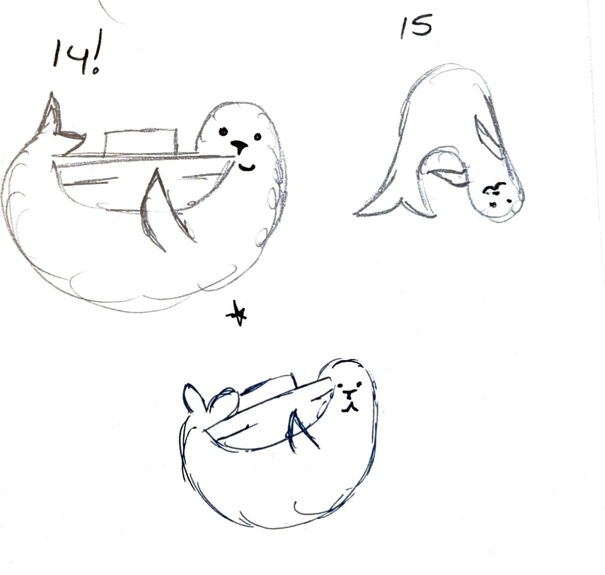


For this rebranding of a city, I chose Astoria Oregon, a destination that I could bring both childhood memories and extensive research into the city to learn about the culture and create a branding that really fit the town. For Astoria I wanted to keep the branding rustic like the woods and clean like the water. For the color scheme I chose colors that can be seen regularly around the city, including the Megler Bridge, the salty bay, the fresh sky, the forest that sits close to the town, and the shipping container ships that can be seen regularly throughout the day. For the secondary logo I chose a mascot idea with a sea lion, a character regularly seen around the town.